/Logo%202023%20final%20dunkelgrau.png?width=221&height=97&name=Logo%202023%20final%20dunkelgrau.png)


In the first part of our series "How to Dashboard" I want to show you the functional implementation of a sales dashboard. It is not about the detailed technical implementation, the features of a tool or general visualization tips, but rather about a concrete example how such a dashboard can look like.
The selection of the design tool (Lumira Designer, SAP Analytics Cloud, Power BI or similar) does not play a role in this case, as the end product can be implemented in all common tools.
Our Blog Series "How to Dashboard" at a Glance
|
Initial Situation
Our example concerns a sales dashboard of an international group in the pharmaceutical industry. The group consists of several companies in different countries. The dashboard should contain an aggregated overview including the possibility to look at different regions in detail.
The data model is deliberately kept simple, so the key figures are aggregated at company level and not broken down into individual products. The data comprises twelve months and two companies in the Group, each active in two sectors and operating in 5 countries.
| Characteristic | Description |
| Company Name | Name of the company in the Group |
| Specific Branch of a Company | Sector of the company. A distinction is made here between products produced for large customers and those for private customers. |
| Region / Month / Year | Country and period in which the company operates |
| Key Figure | Description |
| Costs | The total costs can be divided into general costs, marketing costs and production or acquisition costs. |
| Revenue (Target) | Sales and sales target |
| Sold Items (Target) and Stock Items | Units sold, sales target and stock level |
| Profit | Gain/Profit |
Structure of the Dashboards
The dashboard is classically divided into header and body, with the header occupying only a fraction of the space. The header contains relevant information, navigation and actions. The size and position of the header as well as the placement of the individual elements in the header are defined. Different facts are visualized in the body using the characteristics and key figures. Additional options, such as the filter panel, are collapsed to allow a sleek and minimalist design.
Details of the Header
The header is clearly structured and should provide the user with the most important information at any time, such as "Where am I currently" and "Which selection have I made".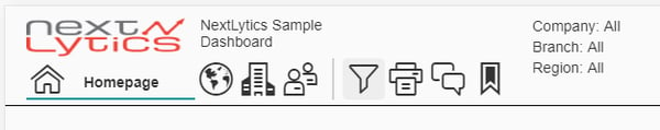
The header contains the company logo and the dashboard title. The navigation can be done with icons. To make it clear on which page the user is in the dashboard, the respective icon and the current page name are highlighted. All other page names are hidden.
The action icons are separated from the navigation by a fine line. These trigger various actions, such as exporting PDF files, writing comments or saving bookmarks.
The remaining texts serve as an overview of which filters are active and change according to the selected filters in the Filter Panel or the selected period.
Details of the Body
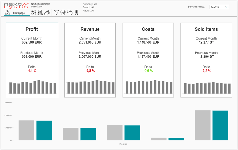
The body is the actual heart of the dashboard, in which all data relevant to the user are displayed. Our example contains a start and detail page. The start page contains the four most important key figures together with an interactive comparison chart. On the detail page, the key figures can be viewed in more detail.
The Start Page
The start page consists of four KPI tiles that allow interaction with the graphic below. Each KPI tile is dedicated to one of the four most important metrics. It consists of the current monthly value, the previous month's value including a color-coded delta and a micro trend chart to visualize the course of the month over the last twelve months. KPI tiles and a simple bar chart were deliberately used in order not to overload the start page and to overwhelm the user with information. Complicated graphics that often cannot be captured immediately or rather unknown chart types should be avoided on the start page.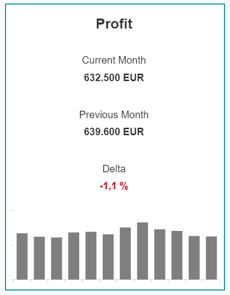
The structure of the tile summarizes the current status and the development of the key figure at a glance. In our case, the previous month was chosen as the comparison value, but in many cases a target value also makes sense. The delta of both values is colored in order to ignite a greater signal effect. We use a simplified representation of green and red and deliberately avoid a yellow corridor.
The tile that has been elevated and is thus active is taken up again in the lower graphic. It contains the current value and the comparative value per region. In addition, the selection of the KPI offers a small interaction possibility for the user without distorting the display on the start page.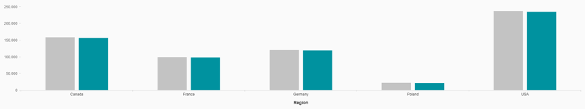
Detail Page
Detail pages provide more information on a specific topic and often allow drill downs. On our first detail page we take up the superficial analysis by regions of the start page again and increase the level of detail.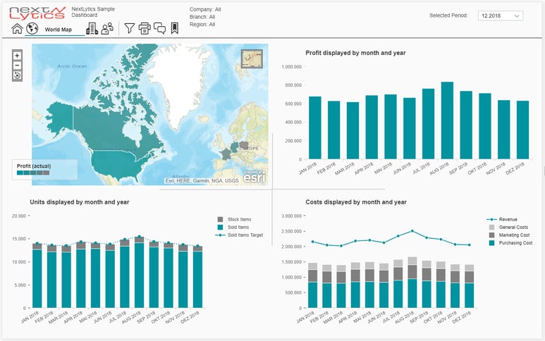
The first graph on the detail page is a world map that colors the regions by profit. By selecting a region on the world map, all other graphs are restricted to this region.
Dashboarding with SAP Analytics Cloud -
Download the Whitepaper here!

The other graphics each represent a key figure of the start page in detail over twelve months. In the lower left graphic, not only the units sold are valued, but also the stock level and the sales target.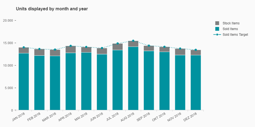
Another graphic splits the key figure costs into their components and relates them to sales.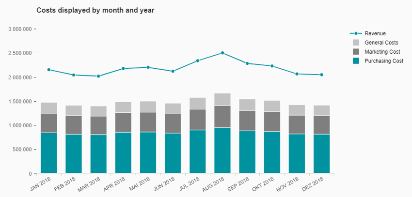
Our example ends after the first detail page, but in practice this is rather the exception. Dashboards often contain several detail pages that show different areas, facts or key figures in detail.
Towards the end we want to introduce three more popular features.
Global Filter
A global filter applies to almost all data sources and graphs within a dashboard. If the dashboard is used by many users, for example across regions or departments, the filter is an indispensable helper.
Bookmark Feature
Even if a dashboard has been designed to be simple for the user and he can access his relevant data with just a few "clicks", there is often a desire for a bookmark function. We implement this as a popup so that the rest of the dashboard cannot be changed during the bookmarking. Bookmarks can be saved, loaded, deleted and sent by e-mail. In addition, it is possible to select a default bookmark so that the dashboard always starts in the desired configuration for the user.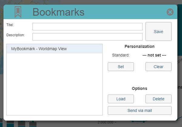
Comment Feature
The amount of data in our daily work is constantly growing and some information is not stored in the IT system. An ingenious comment function makes the dashboard much easier to use. In our example, it is possible to save and recall private or global comments page by page.
Our Conclusion - How to Dashboard
A successful dashboard should always be designed and implemented in a goal-oriented manner. Minimalism and simple structures create an oversight. Often "less is more" applies, because easily understandable graphics, which the user can grasp faster, trump complex representations. If possible, familiar symbols and icons should be used, which have established themselves as the standard - this increases user acceptance. Even if each dashboard is dedicated to a different topic, it is still possible to create a uniform "look & feel" by repeatedly using components such as the header, navigation, global filters and other elements.
The essential information is processed and summarized with the possibility to drill down deeper into the analysis. Key figures and evaluations are standardized so that all users work with the same tools on the same basis. The dashboard creates a single point of truth and leads to a better reporting.