/Logo%202023%20final%20dunkelgrau.png?width=221&height=97&name=Logo%202023%20final%20dunkelgrau.png)


In the first article of our blog series "How to Dashboard" we developed a Sales Dashboard visually. In the second article of the blog series I would like to show you today the technical implementation of this dashboard with SAC Story.
Our Blog Series "How to Dashboard" at a Glance
|
You have probably already noticed that a lot is changing within SAP Analytics Cloud (SAC). With each new release, new functions are introduced. That's why it's not uncommon for smaller functions to be missing in many places within SAC. At these points we point this out and keep you informed about future developments.
Goal
The aim is to develop a sales dashboard for an international group in the pharmaceutical industry. The group consists of two companies in five different countries. To keep this example simple, two dashboard pages are created.
The first page will give an aggregated view of four KPIs:
The second page provides an overview of the costs:
Creation of the Story
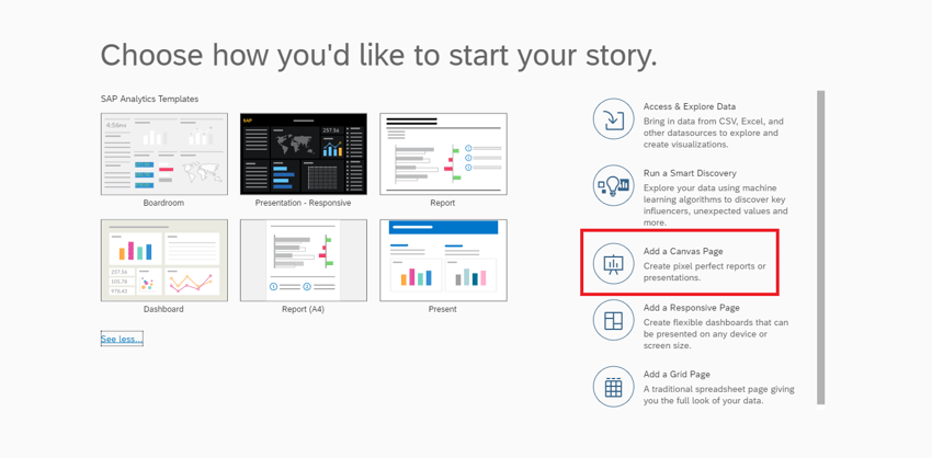
First, a simple "story" is generated and a simple canvas page is created. In this case, this makes more sense than selecting a dashboard template (left area), since a separate layout is to be created. In addition, six different pages are created in this template, which are superfluous for this case.
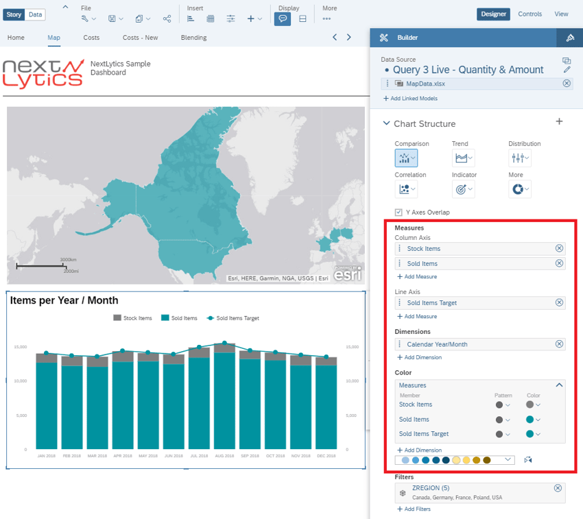
A component must then be added to the empty canvas page. To do this, we select a simple diagram of the associated (data) model. The content remains empty for now, since the header of the dashboard is to be edited first.
Creation of the Header
Before the actual dashboard is started, a header is created. The header remains the same regardless of the different sides. In this case, the header does not contain any essential information (no controlling elements or display of filters) and contains only a logo, a title and a separator.
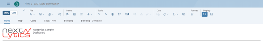
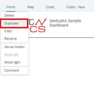
This page can be used as a template for the second detail page and can simply be copied. This works by moving the mouse over a page in the tab strip. Thereupon an arrow opens. A click opens a drop-down menu. There you can duplicate the page.
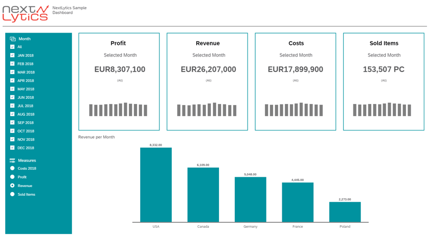
Page 1 - Start Page
The body of the start page can be divided into three sections: Filter, KPIs and Chart.
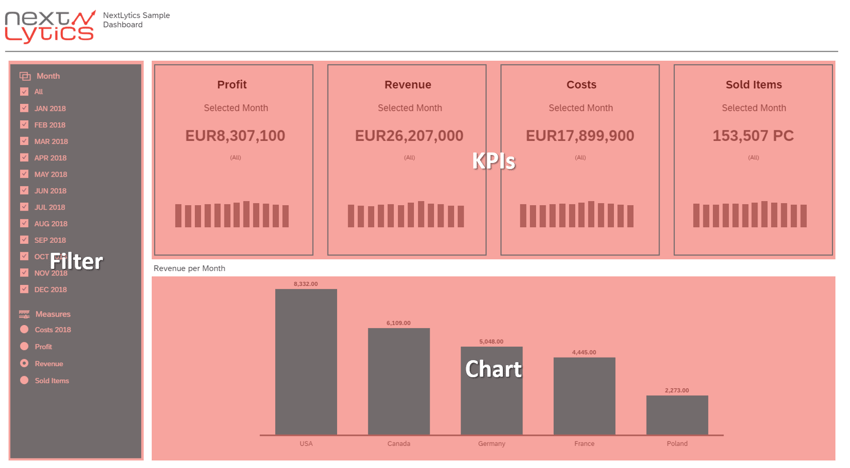
KPI Area
The four KPIs (profit, revenue, cost and items sold) are to be presented in a total of four tiles.
A KPI tile consists of a title, the value for the selected period, the selected months and a microchart with bars to create a context to the previous months.
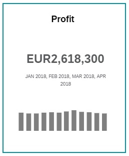
To create a KPI tile, a new rectangle is first created. Currently there are no panels in stories to group related components. The workaround is the creation of a rectangle and the grouping of the respective components. In addition, the background color is changed to transparent and a frame is added. The title of the key figure is also added to the rectangle.
The previously created chart, which was created when the story was created, is changed to the type KPI-Numeric Point. "Profit" is selected as the key figure. In addition, all other labels are hidden. As soon as "Default" is entered for the font size in styling mode, it adapts to the widget in the best possible way. However, since a uniform size is to be defined for all KPIs, a fixed font size is defined here.
The next step is to create the bar chart as a microchart. A new bar chart has to be created with the same model. All labels are hidden so that only the bars are visible.
The other KPIs (Revenue, Costs and Sold Items) are also generated in such a KPI tile with the same model. For the items sold, the decimal places are suppressed because units and not values are displayed here.
Tip: Up to now, moving several elements at the same time has not worked. For this reason, it makes sense to group the desired elements beforehand and then move them.
Dashboarding with SAP Analytics Cloud -
Download the Whitepaper here!
Chart Area
A bar chart is then created below the KPIs in which the four KPI indicators can be selected. The regions of the pharmaceutical company serve as the dimension. To exchange the KPIs, a page filter for KPIs is required. This is added in the next section.
Filter Area
Page filters generally refer to the data model used and thus filter the widgets (KPI values, charts) on the entire page.
The page filters are integrated in the "Filters" area on the left to filter the key figures for the desired period or to select the key figures in the "Chart" area.
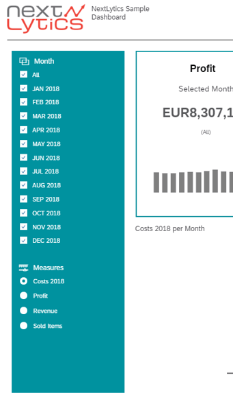
To filter the time period two steps are required: The first step is to add a page filter from the icon menu.
In this case, the filter is made by month and the last 12 months are selected. In addition, the multiple selection of entries is activated. As soon as the height of the filter widget is increased, a selection of the possible months appears in the form of check boxes.
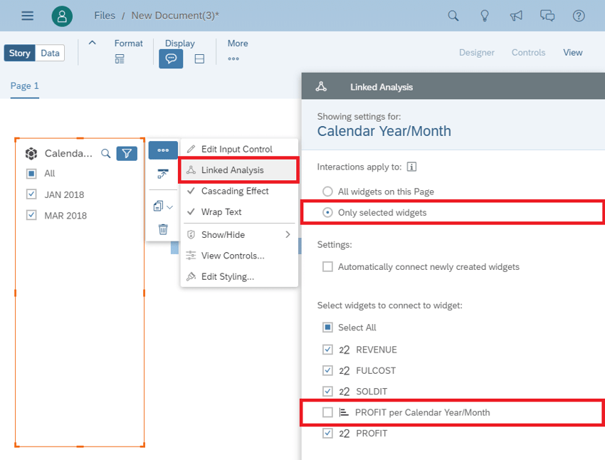
In the second step, the diagrams are linked to the filter widget. Select the widget and click on the action button (icon with three dots outside the widget). Then select "Linked Analysis" from the context menu. A menu opens on the right. The microcharts bar charts from the KPI tiles should remain unaffected by the filters. To do this, the bar charts in the "Linked Analysis" of the page filter must be deselected.
The second filter for the key figures from the "Chart" area is added via the key figure selection in the bar chart (last position).
This makes it possible for the user to select the desired key figure dynamically. This selection box is then placed under the filters of the period. Finally, optical adjustments are made with regard to font, font size and color.
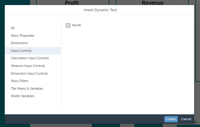
Add dynamic text for selected months
In order to display the filtered months in the KPI tiles, a simple text field must first be created. The action button is then selected and a dynamic text is added.
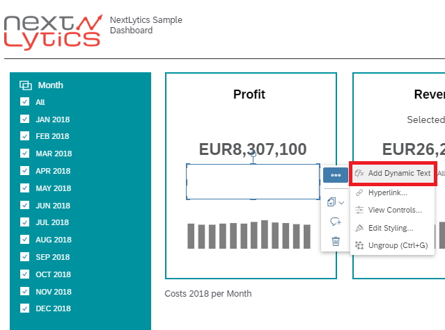
The input controls and the name of this filter are selected in the settings.
If the selection of the months changes, these are immediately displayed in the tile.
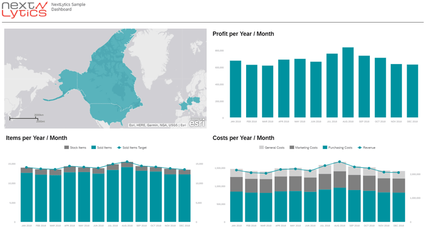
Page 2 - Detail Page
This page was added at the beginning of the header creation process. The goal should be to store the relevant countries in a Geo-Map (world map). In three bar charts the profit, the product stock and the costs of the sold items are to be displayed. With a click on a country, the costs are to be adjusted accordingly. In total, the page can be subdivided into the following four areas:
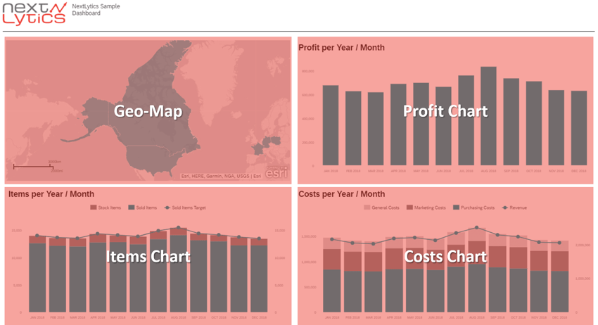
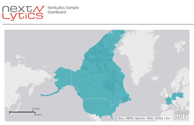
World Map Area
The world map (Geo-Map) requires longitude and latitude outside America. For this reason, a local file was created and the longitudes and latitudes for America, Canada, Germany, France and Poland were stored in a model. In addition, an ID and a description are required for geo data. This map should have no content of its own and only serve as a filter for country selection. As layer type and style we choose Choropleth (area cartogram / drill layer). As dimension we choose the location defined in the (local) model. Finally we change the color, decrease the opacity and zoom.
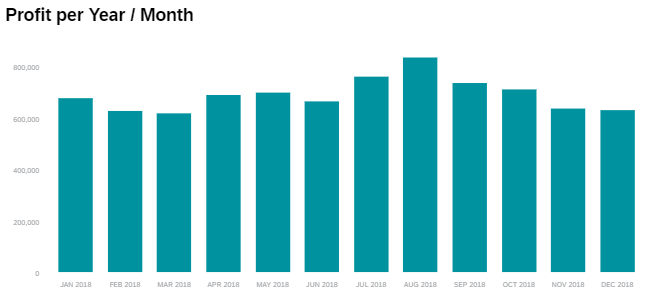
Profit Chart Area
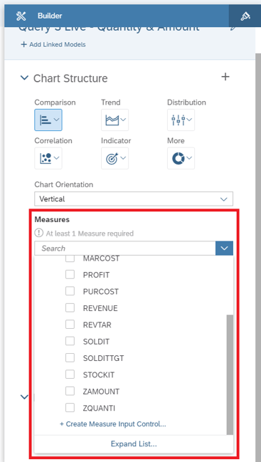
Beside the Geo-Map a bar chart with the KPI Profit is assigned. We select the profit as the key figure, assign the dimension calendar year / month and limit the diagram to a total of 12 months. Finally, optical adjustments (font, font size, labels, color) are made.
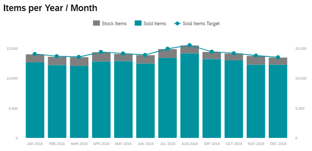
Product Stock Chart Area
Below the Geo-Map the bar chart of the products is arranged. For this a combined bar chart with a line is selected. The products sold and in stock are selected as key figures. The target of sold products is defined as the line. As in the previous diagram, the dimension Calendar Year / Month is selected and the number of months is limited to 12.
Finally, as before, adjustments are made to the color and layout.
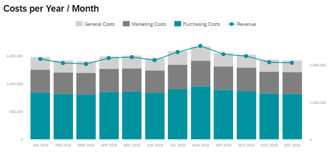
Costs Chart Area
The same chart type is selected for the costs and placed below the profit bar chart. Total, marketing, and purchasing costs are selected as key figures. In this case, the revenue is used as the line. In this case, the dimension is also the calendar year / month and limited to 12 months.
Data Blending and linked Analysis
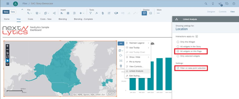
As already mentioned at the beginning for this subpage, when clicking on a country in the world map, a filter is to be set on the three bar charts. The live data model must be blended with the geo data model.
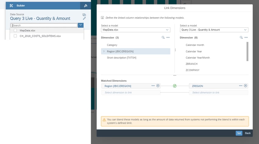
Thus, a linked analysis is created in the world map and all widgets on this dashboard page are selected. In addition, "Filter on data point selection" must be set in the settings so that when you click on a country, the diagrams are adjusted accordingly.
SAP Analytics Cloud Story - Our Conclusion
With this dashboarding tool many functions can already be covered. In addition, no programming has been used, allowing business users to create such a dashboard. With Story the user should only have the possibility to choose from ready-made widgets and templates, which can only be adapted within a small framework.
However, if specific requirements are to be implemented (e.g. special logics), Lumira or SAC Analytics Designer must be used. These, in turn, cannot be created by the business user, but by IT.