
Welcome to the fourth and for now the last article of our "How to Dashboard" series. In the past articles we have already presented the implementation of a Sales Dashboard with SAC Story and Lumira Designer. In this article I will show you the implementation with SAC Application Designer.
Our Blog Series "How to Dashboard" at a Glance
|
In Q4 (2019) the Tab Strip has been released for the Quarterly Release, so that multipage dashboards are now possible. Even though the Application Designer is still under development, you will see that some use cases can already be implemented without any problems.
Goal
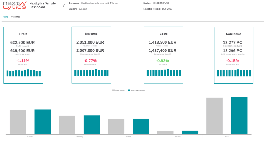
The goal is to develop the technically presented Sales Dashboard of an international pharmaceutical company. The dashboard consists of a start page and a detail page.
On the start page, the four KPIs Profit, Revenue, Costs and Sold Items are viewed:
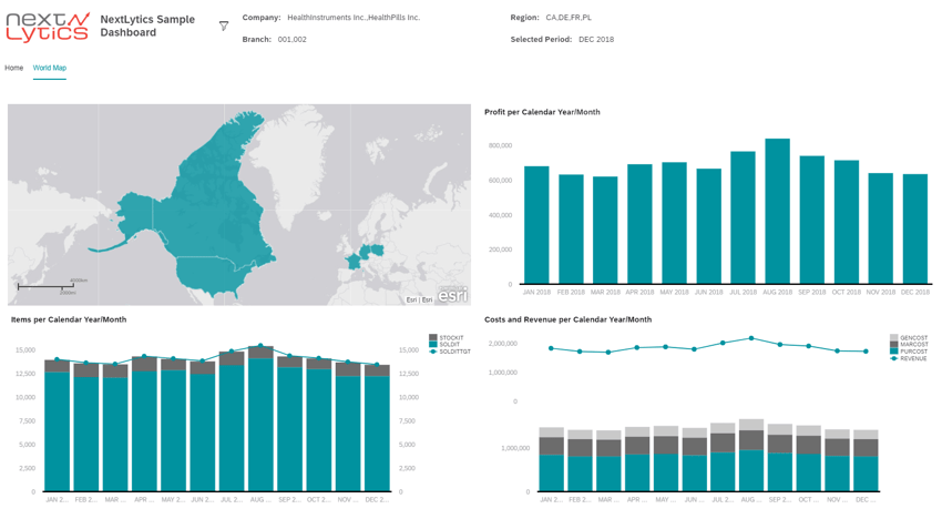
 The detail page deals with the KPIs at country level:
 The first version of this dashboard will have no bookmarking feature. This further topic will be presented in a future blog entry.
Creating a Dashboard
To create a dashboard, you must define an Analytic Application. This application is created directly in the SAC file browser and accessed via the browser. This means that - in contrast to Lumira Designer - no physical software has to be installed for the creation.
Data Source
As you can see from our whitepaper, there are different ways to connect data to the dashboard. We choose - as for the SAC Story Dashboard - a Live Data Connection. However, another data connection would also be possible. For the live data model, an existing query with an input variable for the month is used.
Note: Single Sign On facilitates the development of a dashboard. With a live data connection, each time the dashboard is executed again, a query appears for the login data for the SAP system. A configuration is therefore useful.
Dashboarding with SAP Analytics Cloud -
Download the Whitepaper here!
Structure
The following components are used in this dashboard:- Images (for logo and icon)
- Text boxes
- Panels
- Charts (numeric points, bar charts, combined stacked bar charts)
- Tab Strip
- Geo map
- Buttons
- Check boxes
Regarding the general layout, the dashboard consists of a panel for the header and a tab strip representing the body.
Header
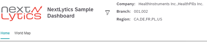
The header consists of the logo, title, filter, filter details and navigation. The title and the filter details are created as text, the logo and the icon as image:
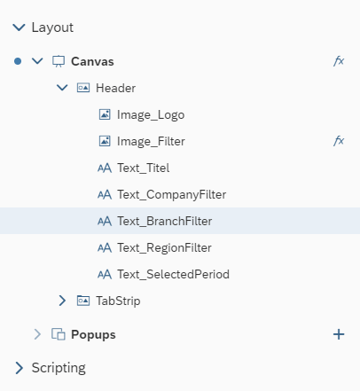
In this case, navigation (and also the display of several pages) is made possible via the tab strip. An adjustment as with the Lumira dashboard (moving the text field when clicking and adding an icon) is not possible in the Application Designer (as of September 2019). Filtering is enabled in scripting and the display of filter details via global variables.
Body - Main Page
The body of the main page essentially consists of the four KPIs and a bar chart at the bottom of the body.
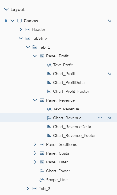
The KPI tiles are not provided out of the box in this representation and must be created manually. The structure of all tiles is the same. A tile consists of a title (text field), the KPI value for the current month, the previous month (both as Numeric Point type diagrams), a relative variance from the last month (also as Numeric Point type diagrams), and a bar graph that shows the history of these KPIs for the last months.
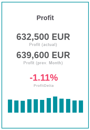
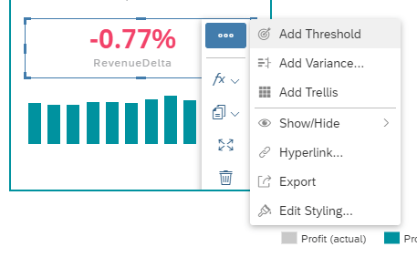
To relieve the dashboard, the calculation of the delta comes from the query and is colored using a conditional formatting (Action Button - Add Threshold).
By selecting the variables in the prompt, the previous month is recorded in a key figure, which means that no separate logic is required in scripting.
Footer Chart
In the lower part of the body there is a bar chart which compares the KPI values from the current month with the previous month. Click on a KPI tile to adjust the value in the bar chart.
Body - detail page
The GeoMap was released in Q3 (2019) for the Application Designer. So far, no interaction with regard to programming is possible (Q4 2019), therefore a linked analysis cannot be implemented. On the other dashboards of our blog series, a linked analysis in the map was made possible, so that when clicking on a country, the charts are adjusted. In this case the GeoMap is only used for optical purposes.
In addition, a bar chart was created for profit, two (combined) stacked bar charts for products, sales and costs. At this point, reference is made to the Stories Dashboard because the diagrams can be created in the same way.
Scripting
The logic is somewhat different from that of Lumira Designer. The programming language is still BIAL (BI Action Language), but the structure has changed and SAP wants to be closer to the user (SAP calls this "close-to-user"). This means that DataSources can no longer be referenced directly. From now on, it is necessary to obtain the reference to a DataSource using a component with the "getDataSource" method. To illustrate this: Using a diagram, we get the reference to the DataSource or model using the method.
A total of five auxiliary methods and ten global variables were created. Variables can either be created locally directly in the scripting or declared globally across the entire Analytic Application. The global declaration then takes place via "Script Variables". Methods are created under "Script Objects" and are clearly structured.
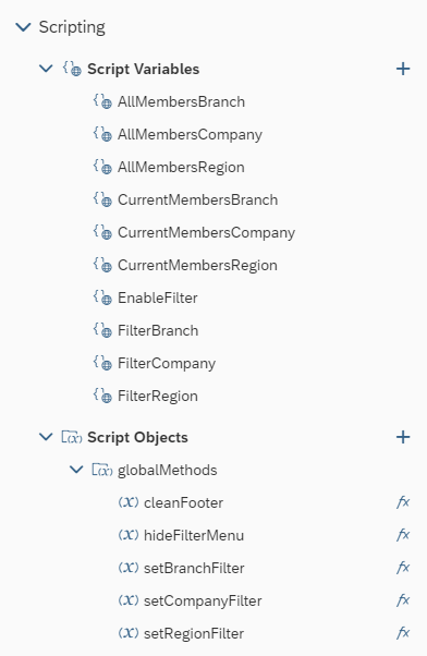
Explanation of the generated global variables:
"AllMembers": All values of the dimensions (Branch, Region, Company)- "Current": Selected values of the dimensions (e.g. for the checkboxes for the global filter)
- "EnableFilter": Holds whether the menu is extended.
- "Filter: Saves the filter details of the individual dimensions for the header.
The method "cleanFooter" was declared for the KPI tiles in order to delete the key figures of the diagram from the lower part of the body. When clicking on a key figure in a KPI tile, the key figures are temporarily stored in a variable and transferred to the diagram from the lower body. But before this happens, the values must be deleted by the method. By choosing the same model, the key figures can be exchanged easily.
The logic of the methods for the filter is explained in the next section.
Global Filter
Before starting with the logic, the layout of the filter panel should be explained in more detail.
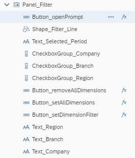
Note: The filter component can also be used instead of the checkboxes for the dimension values. This requires less coding effort and can also be connected directly to the model in the Builder. At this point the dashboard shall be implemented close to the other dashboards of this series.
A panel, text fields, three checkboxes, a line for clarity and a total of four buttons are required for the filter area. It would also have been possible to display the filter via a popup. The disadvantage, however, is that the clarity in the Builder suffers and several components lie on top of each other.
In the "OnInitialization" method (executed when the dashboard is initialized), the DataSource is determined. This is needed to write the individual values for each of the three dimensions into an array and to fill the checkboxes for the filter panel.
The actual filtering takes place in the three set methods for the dimensions. The first step is to delete all values from the components and then assign the selected dimensions from the filter panel. These methods are then assigned to the buttons "Set selected" and "Set all". To delete all values a code was added to the function of the button "Remove all", which deletes all values from all components of the start page. The button "Set Period" only contains the code that the prompt of the model should open.
The filter panel opens as soon as the filter icon in the header is clicked. In the Application Designer, it is not yet possible to expand a panel sideways. Therefore, in the "hideFilterMenu" method, the position of each individual component is set separately so that there is no overlap between the components.
Our Summary - Dashboard with SAC Application Designer
As we have seen, a number of things are already possible with Application Designer at this point; this arouses interest in the further development of the tool. The Tab Strip enables multi-page dashboards, making the tool practical.
In other places you can see that the tool is still under development. Some components are not yet mature, such as GeoMap, while other components or features are absent, such as Grid or DataBinding.
The present dashboard has also shown that the filter approach is associated with more programming effort and can also be solved directly via the filter component.