
In the previous articles of our blog series “How to Dashboard”, a sales dashboard was created using different BI dashboarding tools. In this article, we would like to take you through the process of implementing the aforementioned dashboard using Apache Superset.
Our Blog Series "How to Dashboard" at a Glance |
Apache Superset is a BI tool, used for building interactive and visually appealing dashboards. The main benefits are that it is free and open-source, as well as developed to handle large amounts of data (big data) at petabyte scale! Also, Apache Superset’s data processing and visualisation capabilities rely on SQL, allowing users to explore, model and visualise data based on their unique business needs. Superset also supports connectivity to almost any database making it a great reporting tool to explore. In our scenario we have connected to a SAP HANA database of a SAP BW system.
Goal
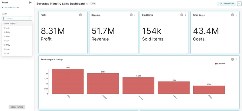
The goal is, as previously, to develop a sales dashboard for an international group in the beverage industry. The presented dashboard contains two sections, a general overview section and a details section.
In the general section, the four following KPIs are presented in an aggregated view:
- Profit
- Revenue
- Costs
- Sold Items
In the details section, the KPIs mentioned above are presented in more detailed, interactive graphics, on a country level.
Well, let’s start creating our dashboard!
Implementation / Creating the Dashboard
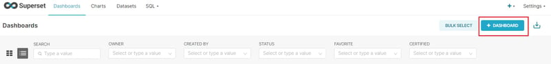
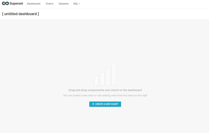
To begin with, an empty, untitled dashboard must be created in order to begin populating it with the charts described above.
Then, the data charts are added in order for the dashboard to begin taking form.
General Section
The general section is segmented into the following three sections: KPIs, Chart and Filter.
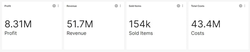
Creating the KPI section
The KPI section contains 4 KPI tiles that display profit, revenue, costs and sold item quantity.
The KPI charts contain the aggregated value for the period selected in the filter and a title that describes the KPI, in order for the dashboard users to have a quick overview of the important metrics.
In order to create the KPIs, a Big Number data chart is selected with the corresponding key figure as a metric (Profit, Revenue etc.).
Creating the Chart section
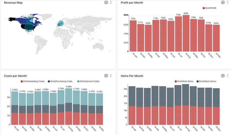
Below the KPIs, a bar chart that shows the amount of revenue for every country that the company sells to is presented.
Dashboarding with SAP Analytics Cloud -
Download the Whitepaper here!

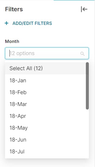
Creating the Filter section
The filter section serves as a way to manipulate the results of the dashboard and can be applied to every chart on it or even specific ones depending on the reporting need.
We can easily create a filter by clicking on the filter button on the left side of the dashboard and selecting the “ADD/EDIT FILTERS” selection.
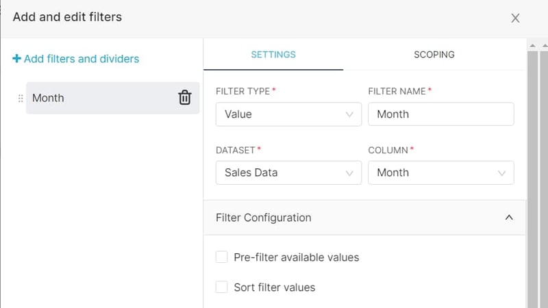
For this example, we are going to name our filter as “Month”, and we are going to select the filter column from our dataset, in the “Settings” tab.
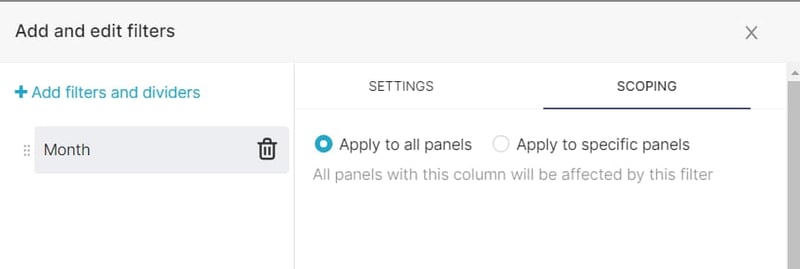
We also check out the “Scoping” tab, which allows us to control In which charts will the filter apply.
Finally, we add any details needed, like for example a sorting of the filter values and we save our filter.
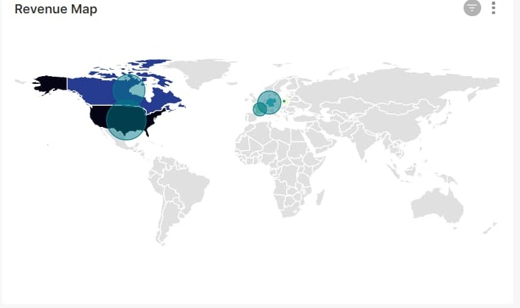
Details Section
The details section is a section of charts that visually displays the aggregated information of profit, items and costs in more detail. In this example, we are going to use a geo map, to visually display the revenue for every region, as well as different bar charts that show how the data of profit, items sold and costs vary over time and compare to each other.
In order for the World Map chart to function, a column that contains the full name of the countries is needed. Apache Superset provides 3 other formats for the country field to be automatically recognized, but in this example the full name will be used. The revenue is used as the metric, in order to visually display it in the world map.
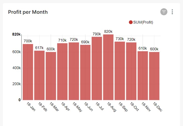
Profit Chart
Next on the list is the profit chart. We create this chart by using a time series bar chart that uses the Profit column as a metric. In order for the time column to be used, we must define a date type column in the dataset we are using. In this example, the Date column is used and limited to 12 months and is automatically selected by Superset, as it is the only date type column in the dataset we are using.
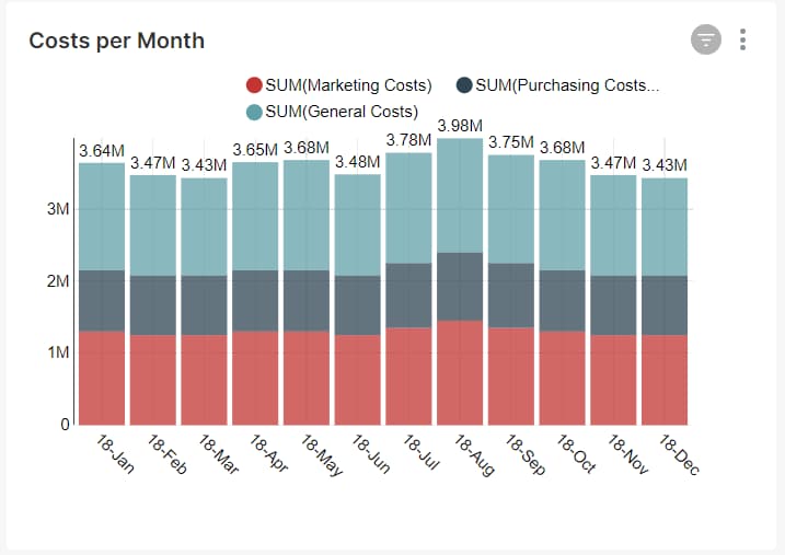
Costs Chart
In order for the costs chart to be created, a time series bar chart is used again, using the different types of costs as metrics. The chart is using the Date column as a time column.
For better visualisation purposes, we select the “Stack Series” and “Show Values” options in the “Customise” tab in order to compare the different types of costs easier.
We finally name the axis, select the colours and save the chart.
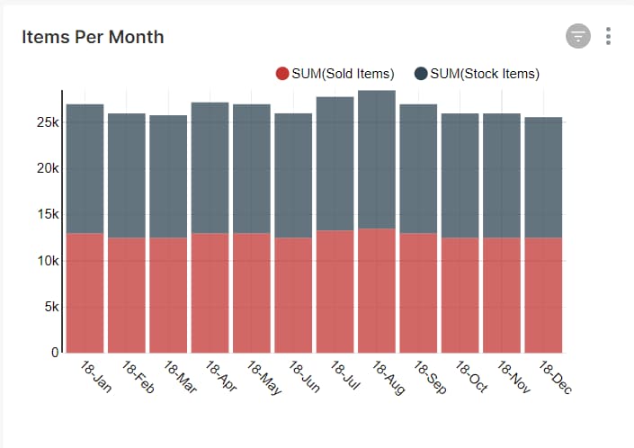
Sold Items Chart
The Sold Items are displayed as a time series bar chart with the quantity of sold items and stock items as metrics. The chart is also using the Date column as a time column and the values are stacked for better comparison.
Dashboard with Apache Superset - Our Conclusion
To conclude, Apache Superset is a very flexible tool that allows the user to create aesthetically appealing dashboards and charts without the need for coding and programming. It is easy to understand and intuitive and it gives the opportunity for fast reporting capabilities and different options for database connectivity including SAP HANA and data manipulation even make it an alternative for the paid alternatives like PowerBI, Tableau and SAC in some scenarios.
Do you have questions about this or other topics? Are you trying to build up the necessary know-how in your department or do you need support with a specific issue? We will be happy to help you. Request a non-binding consulting offer today.