
SAP Analytics Cloud (SAC) Application Designer allows you to develop custom widgets (components) for your dashboards that can be tailored to your business-specific requirements. In a previous blog post, we already introduced you to our custom widget, the NextLytics Smart Tile, to bring you an example of how SAP Analytics Cloud custom widgets can be used. Today we would like to give you an update on the latest release of our Smart Tile.
Key Performance Indicators (KPIs) are an essential part of a dashboard. For this reason, you have the option within SAC to display important KPIs as a numerical point and to compare them with any comparative value such as the original planning value or the value of a previous period. To do this, you can easily add the corresponding deviation to the chart and color-code it.

The functions available out-of-the-box for displaying such KPIs in SAC are already a good starting point, but such a presentation does not enable the viewer to draw any further conclusions about the context of the respective KPI. It remains unclear how the actual value of the KPI fits into the current trend and whether the overall development is rather positive or negative. For further insights, we needed a more granular overview of the behaviour of the KPIs over time.

Analyze your KPIs in the proper context
NextLytics Smart Tile offers you all this and much more. It gives you a deeper insight into your KPIs by putting them in the relevant context and providing a lot of additional information on comparison values and deviations. On top of that, it is highly customizable and can be fully tailored to your business needs.
The Smart Tile comes with the following features:
- assign up to 4 KPIs with 4 comparative values to each tile
- Different options for displaying the deviations: absolute, relative or per indicator
- Change the type of presentation during runtime
- Optional mini-charts show the development of the KPIs over time
- Interactive elements for switching between different pages
- Detail page with additional information on the comparison values
- Extra page for free text for comments, descriptions etc.
- extensive customizing options
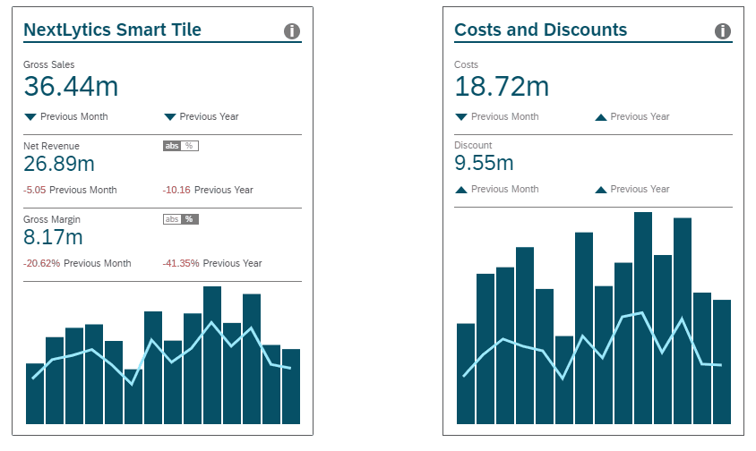
In addition to the values of selected KPIs and the deviations from specified comparison values, the Smart Tile shows a graphical overview of the changes of the key figures over time. If you are already familiar with previous versions of the NextLytics Smart Tile, you may have noticed that we no longer need an extra tile for each KPI, but can now display several KPIs in the same tile. For this reason, we have added an additional chart for another KPI to the previous presentation of the development over time. Instead of only showing the changes of a single key figure with a bar chart, you can now also trace the development of another KPI with a line chart. The size of the diagrams adapts dynamically depending on the number of KPIs displayed in the tile.
Dashboarding with SAP Analytics Cloud -
Download the whitepaper here!
Greater insights thanks to alternative display settings and additional pages
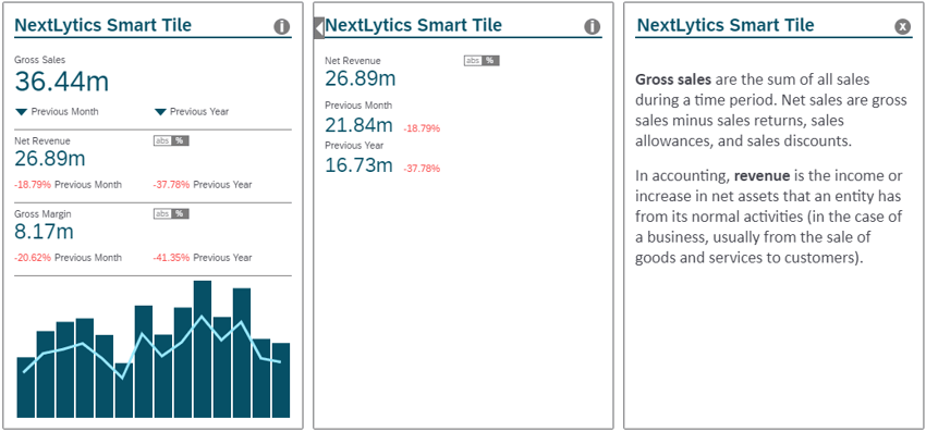
As before, it is possible to display the deviation from a specified comparison value for each KPI and to switch between absolute and relative deviations. In addition, it is now possible to choose a lean presentation with simple arrow indicators. Corresponding icons show whether the current value of the KPI is higher or lower than the comparison value without indicating the extent of this deviation. For further information on the comparison values and the respective deviations, you can switch to a detailed page by clicking on the KPI value. Both the arrow icons and the numerical deviations can be conditionally formatted according to KPI-specific threshold values.
The information icon in the upper right corner of the tile takes you to another page, where additional comments and descriptions of the KPIs or the comparison values can be displayed after you set them up via a text editor in the corresponding tab of the Builder Panel.
Various Customizing Options
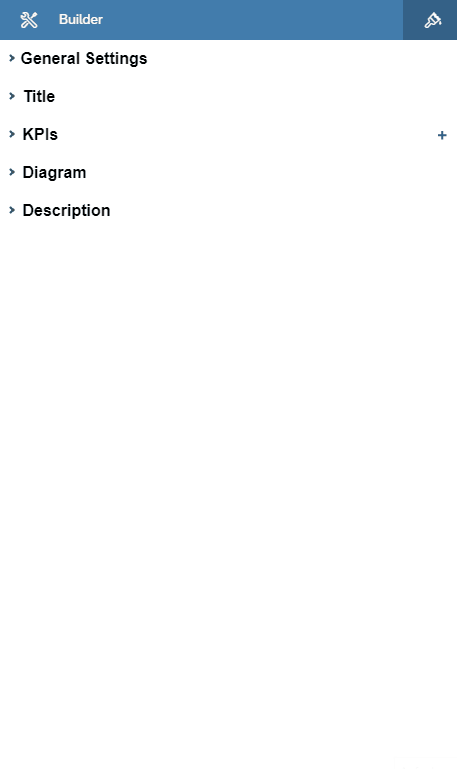
Using the two design panels, you are able to customize the Smart Tile as you wish. You can include several KPIs with up to four comparison values each in the tile and format the different KPI sections individually. All texts within the tile, such as the title and the names of the KPIs or the comparison values, can be adjusted by double-clicking on the text via inline editing. You have the following options to customize the Smart Tile via the Builder Panel:
- Add placeholders for additional KPIs and for comparison values that can be filled with data through scripting
- Define the initial presentation of the deviation
- Show/hide a toggle switch for switching between absolute and percentage values
- Set thresholds for conditional formatting of the deviations
- Choose between different icon sets for the arrow indicators
- Specify colours for the buttons and for the conditional formatting of the deviations
- Show/hide the diagrams
- Entering a description for the back of the tile
- extensive formatting options for texts, numbers and both diagrams
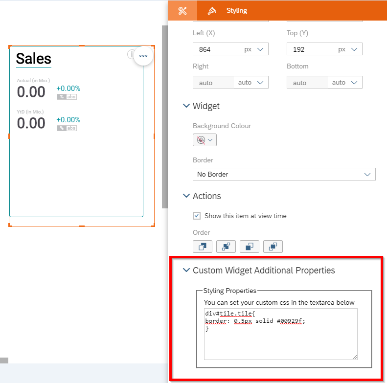
The styling panel can be used to configure the size and positioning of the Smart Tile as well as to adjust the border or background colour. If necessary, experienced users can make additional adjustments via CSS.
Data binding for custom widgets is still not available (as of Q2 2021)
SAP has not yet enabled data binding for custom widgets with past updates of the SAC. As long as no specific model can be connected to the widget, it must be filled with data in an intermediate step. To do this, take the required data from a table, store it in an array and then transfer the data to the custom widget. The table used to do so can be hidden later if necessary.
SAP Analytics Cloud Reporting - Our Conclusion
Using custom widgets, you can create a bespoke solution that addresses your specific business needs. Nevertheless, the development of these components requires HTML, CSS and JavaScript knowledge and is therefore reserved for experienced web developers. However, once such a widget has been created, it can be easily reused and integrated several times into different dashboards. Thanks to the easy integration of external custom widgets, you can easily add the NextLytics Smart Tile to your SAC environment and enhance new or existing dashboards with a highly customizable KPI tile.
If you need assistance with the planning and technical implementation of a custom widget, or if you would like to integrate our Smart Tile into your SAC dashboards in the future, feel free to submit a non binding request.