
Dashboarding with Tableau is unique. Unlike with other tools such as SAP Analytics Cloud or Power BI, you don't work directly on the actual dashboard, but first create the charts and tables you need on separate worksheets and then merge them into one dashboard. This unusual workflow provides room for exploratory analysis while the dashboard is being created, as there is a much greater focus on developing the individual components of the dashboard. The challenge of this approach, on the other hand, is keeping the big picture in mind and creating visually appealing dashboards. In our blog series "Dashboarding with Tableau", we will provide you with valuable tips and proven best practices based on concrete examples that will make your work with Tableau easier and lead to better results.
Our Blog Series "Dashboarding with Tableau" at a glance
|
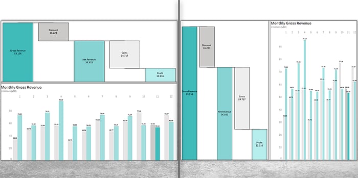
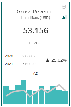
In the first part of our blog series, we already created some components, which we would like to combine into a KPI tile today. In doing so, we will explain how individual worksheets become dashboards and which tools are available to you during this process.
.png?width=700&name=Dashboard%20(1).png)
Why you should not rely on dynamic resizing
Before we start combining the worksheets into a dashboard, we need to set the resolution of the dashboard. We have chosen a resolution of 1200 x 700 pixels. In addition to fixed dimensions, you can also specify ranges for the height and width of the dashboard, or select the automatic option so that the size of the dashboard adjusts to the screen resolution. In this case, the finished dashboard will be displayed either stretched or squeezed when opened.
However, dynamic resizing often comes with negative surprises, as the impact on the size and position of individual dashboard objects is difficult to predict. Furthermore, automatic adjustments impose an additional server load, as the resolution must be recomputed and cached for each device. For this reason, it is best practice to specify fixed dimensions and create different layouts for different device types. This ensures that the dashboard - unless alternative layouts are configured - is always displayed the same size regardless of the device. Depending on the resolution of the device, this means either a white border or a scrollbar at the edge of the dashboard.
Group related objects into containers
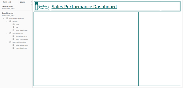
After setting the dashboard dimensions, we start creating the dashboard. In addition to the actual worksheets, users also have other objects at their disposal, such as text, images, or iFrames for embedding websites. However, most important when creating a dashboard are layout containers. These are used to group associated dashboard elements, such as our Tile components, so that they can be flexibly positioned without having to move all objects individually. For this purpose, Tableau provides us with horizontal and vertical containers.
 We start by using containers to define the layout of our dashboard. Therefore, we divide the free space into larger sections, which we then further organize with additional containers.
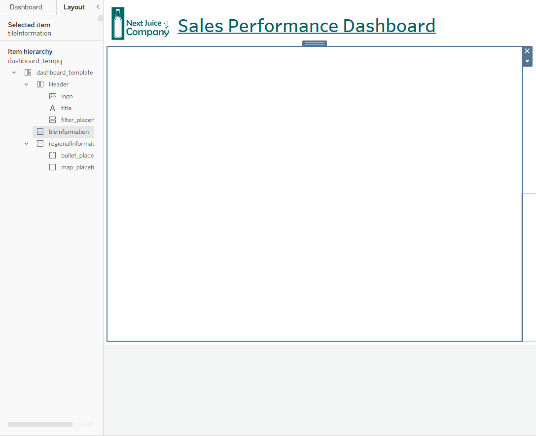
This work requires some patience and finesse. When adding a container to the view, it initially takes up the entire available area. This behavior becomes a pain for users when they want to arrange several containers next to each other in the same container, as in our case. When inserting a container into another container, it takes the entire area of the parent container. When trying to add another container next to the previously added child container, Tableau does not recognize the parent container due to the lack of space and again places the new container in the child container. This then results in three levels of containers. To bypass this behavior, we recommend that you first add a blank element to the parent container as a placeholder and remove it once you have added the required containers to the view.
 Use blank elements to place multiple containers in the same parent container.
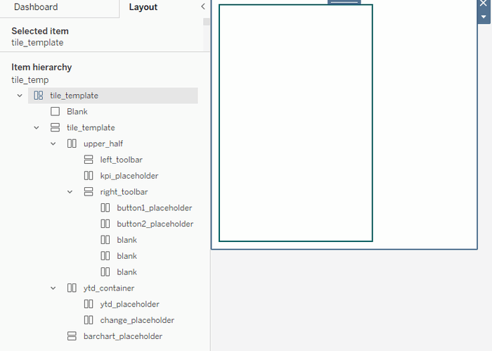
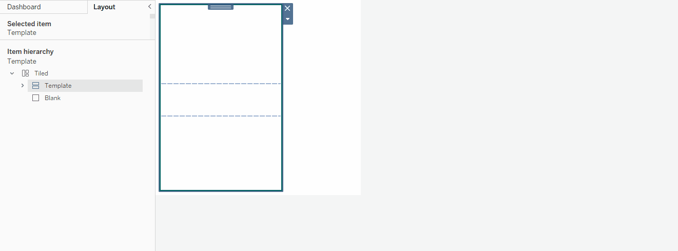
We have not yet added containers to the dashboard layout for the individual KPI tiles. The tile layout is a bit more elaborate, so we'll switch to a new, blank dashboard page and use containers to create the following reusable template for our tile. We will then insert this template into the actual dashboard. While creating the template, we switch more frequently between the dashboarding area, which lists the available worksheets and dashboard objects, and the layout area. The layout area provides users with extensive controls for adjusting the size and position of all objects on the dashboard. Using the element hierarchy, you can check the container structure. To keep a better overview, we recommend that you give your dashboard objects meaningful names. To do this, right-click Rename Item.
Self-Service Analytics with Tableau -
Download the whitepaper now!

We have also added some placeholder containers for the worksheets themselves to our template to make it easier to fill the template with content later. Once a worksheet has been added to these containers later, they can be easily removed to keep the element hierarchy more manageable. Finally, we switch to the layout area once again and add a border to the parent template container. The result looks like this:
Use the copy and paste function for nested containers
Working with nested containers can be a nerve-wracking and tedious task. Fortunately, Tableau has realized this and introduced a copy and paste feature for containers with the new 2021.4 release. We therefore only need to create the framework once and can then duplicate it for the remaining tiles by copying the parent container using the context menu. Unfortunately, however, this function is only available if no objects other than containers, such as worksheets, are part of the container. Therefore, in case you often work with the same complex framework, we recommend that you prepare a template on a separate dashboard page.
Copy and paste is working as usual with CTRL + C and CTRL + V. To fix the pasted object,
drag it into the container while holding Shift (note the previously mentioned workaround).
Watch out for the blue frame around containers
We then proceed to fill the containers with content by dragging and dropping the worksheets into the respective container. While doing so, make sure to drop the element as soon as a blue frame appears around the container. If necessary, check in the element hierarchy whether the worksheet is really part of the container. When adding a worksheet to the view - regardless of the setting on the worksheet level - its title and any controls like filters or dropdowns for parameters are shown. We hide the title and also ensure that those containers that contain multiple worksheets distribute them evenly across the available space. To do this, we enable Distribute Evenly in the context menu of each container. If at this point you notice that some components are not displayed centered, activate Fit Entire View from the context menu and make sure that the display is centered at the worksheet level. To adjust the formatting of a worksheet, you do not have to navigate to the respective worksheet. Instead, you can use the context menu to access the formatting panel.
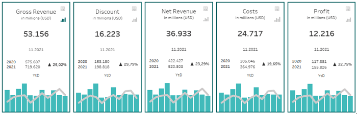
In addition to the described components, we also add two buttons to the Tile, whose function will be described in the following articles. As a result, we get the first draft of our KPI Tile.The procedure can then be repeated for the remaining KPIs.
Detaching objects from the grid
For our KPI tile, we only use fixed (tiled) objects. By default, objects are placed side by side in a grid that you can show by choosing Dashboard > Show Grid or pressing G. However, there is an option to detach objects from this grid to place them anywhere you want. A possible scenario in which you might want to do this would be to position a legend on the associated worksheet. A legend usually represents a separate dashboard object that must be placed next to the worksheet like a control. To bypass this,, you can either select the Floating option in the object's context menu, or you can enable floating in the dashboard pane before placing the object in the view. However, special care should be taken here if the dashboard size is determined dynamically: Resizing can cause floating objects to move unexpectedly and cover important information from other charts. We therefore recommend that you use this option only in exceptional cases. As is often the case with dashboarding, the proof of the pudding is in the eating.
What's next?
Now, the centerpiece of our dashboard is in place. The KPI tile already looks good, but is still pretty boring without interactive elements. In the next posts of our blog series, we will therefore add interactive elements to our tiles, which can be used to modify other charts of the dashboard. Before that, however, we will first add more charts to it.
In the following weeks, you'll learn how to develop custom charts like waterfall charts and how to create buttons that give you much more possibilities than the standard buttons available in Tableau.
Do you have questions about this or other topics? Then feel free to contact us! As Tableau partner, we are happy to advise you on all aspects of deployment, administration and best practices for effective Tableau Dashboards.