/Logo%202023%20final%20dunkelgrau.png?width=221&height=97&name=Logo%202023%20final%20dunkelgrau.png)


In the previous article of our blog series "Dashboarding with Tableau" we combined the various worksheets we created in the first article into one common KPI tile. In the next articles, we would now like to extend our dashboard with a bar chart that shows the yearly progression of a single KPI. However, we do not want to attach a specific KPI to the bar chart, but rather give the user the option later to dynamically change the KPI during analysis. Changing the measure, in turn, can be done using buttons embedded in the various tiles.
Our Blog Series "Dashboarding with Tableau" at a glance
|
 Why you should read an article about bar charts
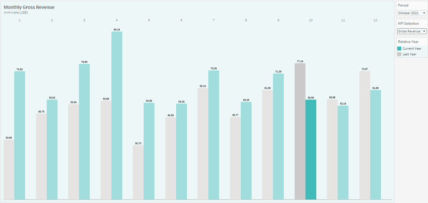
Tableau is a self-service tool. Therefore, creating a simple bar chart is not a big challenge. However, in addition to the ability to swap out the displayed KPI using a button, we would like to add some other visual features to our chart that require additional steps. Our chart contrasts the development of a KPI within different years using different colored bars. By default, the distances between all bars are the same. To keep our chart clearer, we would like to group the bars by month by increasing the distance between the 12 pairs of bars. This requires a few steps, which we will explain in more detail later in this article.
In addition, we want to make sure that those bars that relate to the selected month are highlighted. Tableau already has a highlighting action that uses mouseover or selection to highlight individual data points. Instead of using the predefined function, we will add a highlight effect to the chart that requires no further interaction by the user. We will simulate this color highlighting by adding an additional bar layer to the chart that slightly darkens the bar pairs of the 11 remaining months, making the bars of the month under consideration stand out.
How can we dynamically exchange measures in a chart?
Before we visually enhance our chart, we first need to implement the actual core function of the chart: the dynamic exchange of KPIs during analysis. The trick here is not to place the actual KPI field in the view, but a calculated field that refers to the KPI via a parameter.
Parameters replace constant values in calculations, filters, or reference lines and can be changed dynamically during analysis via a control element or by interacting with a chart. We se them to replace the measure displayed in the chart by adjusting the parameter value. To do this, we check the value of the parameter using a case distinction within a calculated field, which in turn takes the value of the corresponding KPI.
The values that a parameter can adopt can be derived from a dimension or maintained manually. When creating the parameter, we set the data type to String and enter the names of themeasures as possible values. We then use the parameter's context menu to display its control in the view and include the parameter value as dynamic text in the worksheet title.
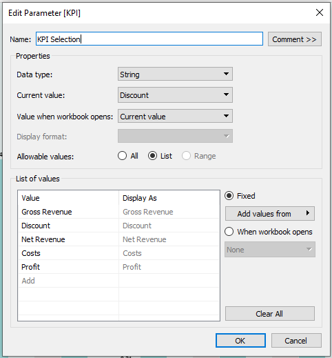
As mentioned, we use the parameter in a case statement within a calculated field. The statement checks the current parameter value and returns the selected measure.
Measure Value

CASE [KPI Selection]

WHEN "Gross Revenue" THEN [Gross Revenue]

WHEN "Discount" THEN [Discount]

WHEN "Net Revenue" THEN [Net Revenue]

WHEN "Costs" THEN [Costs]

WHEN "Profit" THEN [Profit]

END
Self-Service Analytics with Tableau -
Download the whitepaper here!

We then proceed to create the following view. Here we place both the year and month fields in the column container. By default, Tableau places the axis labels (headers) below the bars. If we add another field to the column container, we can determine the position of the different headers by reordering both fields. We then hide the header for the years using the field's context menu.
_Tableau_Parameter.png?width=850&name=container%20(1)_Tableau_Parameter.png)
Finally, we ensure that only two years or bars are shown per month. Therefore we define the following filter condition to include only the current year ( based on the selection of the period parameter from the first article) and its previous year in the view.
Actual or previous year

DATEDIFF('year',[Date],[Period]) <=1

and  DATEDIFF('year',[Date],[Period]) >= 0
For the color coding of the different years, it is not sufficient to place the date field at the year level in the color container. In this case, all years contained in the data would have to be assigned a fixed color each. Instead, the color assignment of the different years should be dynamic and depend on the period under consideration. We therefore distinguish between the current year and its previous year and assign fixed colors to these two properties. To do this, we create another calculated field and place it in the color container.
Relative Year

IIF(  YEAR([Date])= Year([Period]) ,  "ACTUAL" , "LAST" )
How to turn a simple bar chart into an eye-catcher
At this point, the chart is ready for use and can already be added to the dashboard. Before we edit the dashboard, however, let's turn our attention to the visual adjustments described at the beginning: the spacing between the bars and highlighting the bars of the selected month.
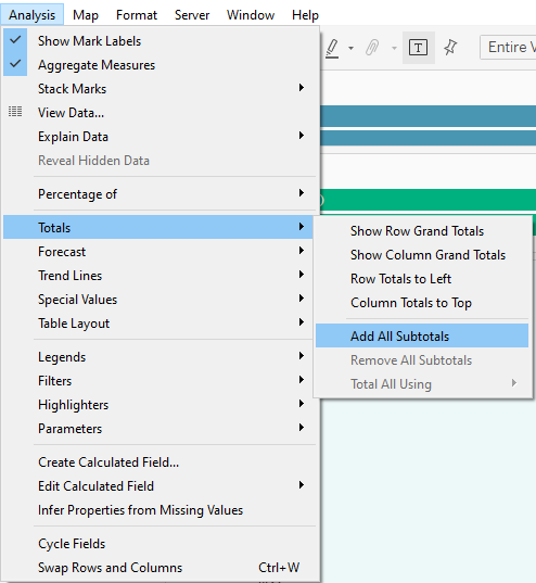
To group the individual month pairs, we add subtotals to the view and directly hide them via the context menu of the calculated field in the row container (Total Using > Hide). After adding the subtotals, Tableau adds a subtotal bar for each month to the view. When hiding the subtotals, the spacing between the remaining bars does not adjust, so the month pairs can now be better identified
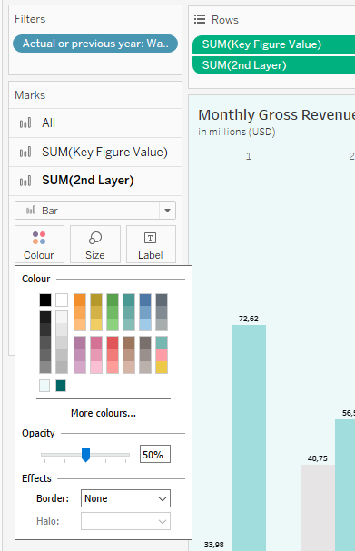
For the additional chart layer, we create another calculated field that outputs the corresponding measure value for each pair of months except the one of the selected month. In other words, the new field creates new bars for all months except the ones of the considered period. We then use the second layer bars to lighten the original 11 pairs in a way that makes the bars of the selected month stand out.
2nd Layer

IF Datepart('month',[Date]) != DATEPART('month',[Period])

THEN [Measure Value]

ELSE 0

END
We add the new field to the view on a second axis, set the bar color to white and the transparency to 50%. Then we make sure that the two axes are synchronized, i.e. have the same measure dimensions, and hide the subtotals of the new field via its context menu.
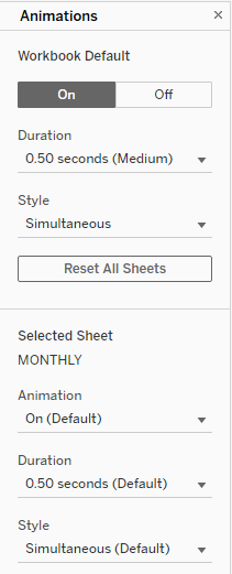
Finally, we activate Dashboard Animations under Format, so when the chart is modified by adjusting the parameters, we can trace the changes of the bars by means of an animation.
What's next?
Now that we have put the finishing touches on our chart by formatting the bar size and label, the worksheet can be added to the dashboard. In the next article, we will add buttons to the KPI tiles from the previous posts that will allow users to interactively adjust the KPI parameter and thus the measure displayed in the chart. To do this, we will not use the predefined buttons, but implement our own logic using separate button worksheets and parameter actions.
Do you have questions about this or other topics? Then feel free to contact us! As Tableau partner, we are happy to advise you on all aspects of deployment, administration and best practices for effective Tableau Dashboards.