/Logo%202023%20final%20dunkelgrau.png?width=221&height=97&name=Logo%202023%20final%20dunkelgrau.png)


Once again, the third quarter of the year brings a new Tableau release with exciting improvements and new features that may make you want to revisit your existing dashboards. In this blog post, we'll introduce the changes that have been made and what new features you definitely shouldn't miss.
Show and hide dashboard components with dynamic zone visibility
When it comes to community, Tableau is virtually second to none. Hardly any other dashboarding tool has such an active community as Tableau. In the annual Iron Viz data visualization competition, participants from different countries try to get the most out of Tableau and make the seemingly impossible possible. This results in a number of sophisticated workarounds and Tableau hacks that enable you to add features and visualizations to your dashboards that are not available out-of-the-box, such as waterfall charts and custom buttons. However, some of these workarounds rely on complex calculations and therefore have a negative impact on the dashboard's performance.
Considering this, it is hardly surprising that especially those releases, which make cumbersome workarounds unnecessary, cause quite some excitement within the developer community.
With Release 2022.3, Tableau introduces yet another one of these long-awaited features. Users can now dynamically show and hide selected worksheets or entire dashboard sections (containers). Dynamically in this context means that you can make the visibility of the respective dashboard item dependent on a parameter or a calculated field of type Boolean.
This allows you to specify which charts are shown and hidden using a control element or by making a selection within a chart (Parameter Actions).
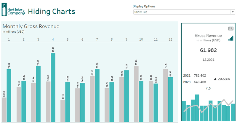
Untertitel/ Bildbeschreibung: If you link the visibility of a worksheet to a parameter (Boolean), the worksheet will only be displayed if the assigned parameter is set as True.
Dynamic Zone Visibility opens up a whole new world of possibilities for Tableau developers. The use cases are so versatile that we will dedicate a separate blog article to the subject in the coming weeks. Nevertheless, we would like to give a few examples without describing the technical implementation in too much detail. In order not to miss the relevant blog article later, subscribe to our newsletter here.
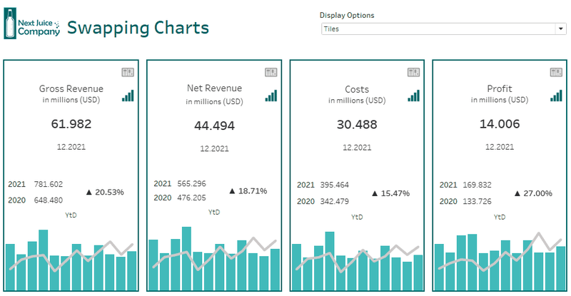
Swapping charts
Swapping basically means hiding one chart and displaying another one at the same moment. To do this, you need to create a calculated field for each one of the charts you want to choose between later. The new field needs to check the parameter value and return True or False depending on a current value. You need to make sure that the conditions defined in the calculated field are mutually exclusive, so that only one chart is visible at a time.
The underlying parameter could, for example, contain the names of the available charts and be modified via a control element. It would also be possible to derive parameter values from a characteristic and change the current value using parameter actions.
Fullscreen-Mode
When a dashboard item is being hidden, the remaining widgets are usually resized. Therefore, to maximize a particular worksheet within the dashboard, you simply need to hide the surrounding worksheets. It is essential, however, to ensure that the dimensions of the widget to be maximized are not fixed, otherwise no resizing can take place and the hidden worksheets will simply leave a white area. For more information on layout containers, read the corresponding article in our Tableau Dashboarding series.
Hideable filter bar
Control elements can take up quite a bit of space sometimes. Therefore, place all filters in a single container, which you can then show and hide using a button that changes the underlying parameter value.
Make your Dashboards more user friendly using the Data Guide
With the Data Guide, Tableau introduces a new panel that provides users with additional information about the dashboard itself and its visualizations, along with the underlying data. Instead of providing dashboard recipients with important hints on how to use the dashboard by using tooltips and text fields, dashboard developers can now include this information along with external links in the Data Guide.
The guide is available for different levels of detail and shows different information depending on the selected element. If you select a worksheet or chart, the Data Guide provides information about the fields used, active filters and outliers in the data. Unfortunately, it only indicates which fields are placed in the filter container. It is not possible to draw any conclusions about the actual filter conditions. If you have created calculated fields, which you use as filters, you should therefore pay attention to a meaningful naming. The panel also lacks information about defined actions in order to be able to determine what happens to the dashboard when selecting a data point.
When selecting a data point within the worksheet, the Data Guide switches to the detail level. Here, users are given additional information about other measures that may contribute to the respective key figure. Essentially, this is an integration of the already available Explain Data feature into the new panel.
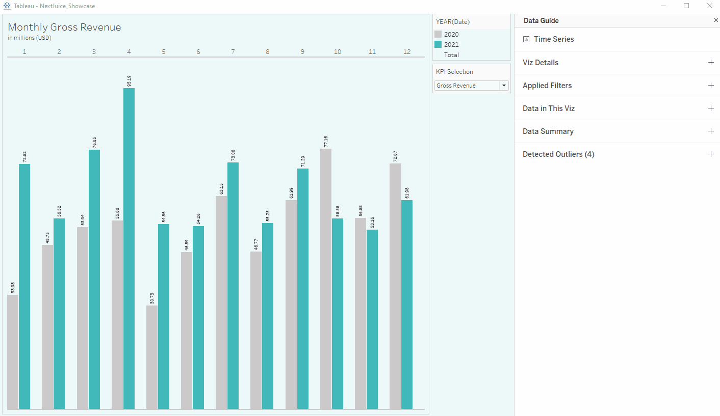
For the admins out there: Unlike Explain Data, the Data Guide cannot be disabled globally. The additional explanations for individual data points are provided independently of the Explain Data settings at the site level. However, users have the option to disable the Data Guide in their personal settings.
Self-Service Analytics with Tableau -
Download the whitepaper now!
Advanced Analytics with Table Extensions
Up until now, Analytics Extensions have enabled users to extend the capabilities of the calculation editor by utilizing external applications, such as Python or R. The script of the respective application is written directly in the calculation editor and forwarded to the application server along with the data. After the calculation is executed by the external service, the result set is transferred to Tableau and stored in the calculated field. Analytic Extensions work at the field level, which means that a separate calculated field with its own logic must be created for each calculation.
Using Table Extensions, users can now transfer entire tables of data from external applications such as Python or R directly into the Tableau data model in real time. The imported Tables are then available in the modeling.
In addition to the improvements mentioned above, there are some minor Quality of Life Improvements that we would like to mention.
Personalized search results
To help users find the right content, Tableau now prioritizes certain search results - similar to Google - depending on user behavior or frequently used content and saved favorites. These are displayed higher up on the list for the user and are therefore easier to access.
New data governance features for the Data Management Add-On
Users who licensed the Data Management Add-On can set data quality notifications for data sources informing users about corrupt or outdated data. From now on, you can additionally set data quality notifications on field level and are no more restricted to the data source level.
Web interface improvements
Tableau has again improved the web environment, further aligning the feature set with Tableau Desktop. With the new update, data types can now be changed directly in the Data Panel of the dashboarding interface. There are also minor improvements to the formatting options.
Eventually, the Web interface will offer the same dashboarding capabilities as Tableau Desktop, making the desktop client obsolete for some users. At this point, however, users often run into limitations that require them to download the workbook and continue working in Tableau Desktop.
Granting permissions while publishing content
When you share content and the recipient does not have the required access permissions, you are prompted - in case you are allowed to - immediately to grant missing permission. For example, if you share a workbook with colleagues, you can give them access to the parent project while sharing. This prevents your colleagues from having to request the missing access permission manually .
Shared administration of external assets
Previously, site administrators were responsible for managing external resources such as virtual connections or databases. Now, it is possible to move those assets to projects, leveraging existing permissions and enabling others to manage the asset.
Dynamic scaling of Tableau Server processes
With each Q1 and Q3 release, Tableau Server receives some new features. The platform now benefits from dynamic scaling of server processes in Docker containers using Kubernetes. Administrators can schedule the number of active backgrounder processes in order to meet the requirements during peak load times and to optimize the performance of the server environment. For example, additional backgrounders can be added when a particularly large number of extracts is being loaded.
Moreover, some additional events have been added to the activity log extending the monitoring options for your server deployment. However, those improvements are only available for Advanced Management Add-Ons customers.
Dashboarding Tableau with Version 2022.3 - Our conclusion
The Q3 release contains quite a lot of new features and improvements. Nevertheless, there are fewer game changers than one might initially expect. Some features like the improved permission assignment and the shared management of external assets were overdue for a while. In addition, not all users benefit equally, as the improvements in the areas of data governance and server administration in particular are behind a paywall and are therefore only available to owners of the Data Management Add-On. These are essential features that should already be included in the basic version of Tableau. However, with Dynamic Zone Visibility, Tableau once again shows that the voices of the customers are being heard. The Data Guide and the table extensions are also promising features. Still, it remains questionable how these tools will be accepted by users and how many customers will actually use the features. In any case, the new features offer enough possibilities to pass the time until the next release.
Are you interested in the topic of Tableau? Are you trying to build up the necessary know-how in your department? Or do you need support with a specific question? Request a non-binding consulting offer today.